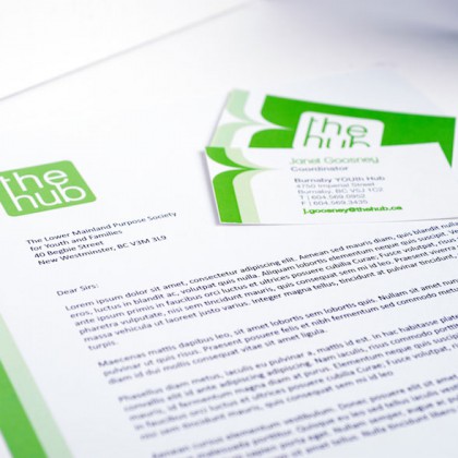
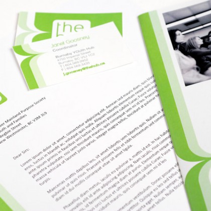
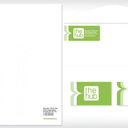
The Burnaby YOUth Hub is a drop in centre for teens that offers a huge range of support services. They are a not-for-profit organization who required an identity system that is professional, but also easy and cost-effective to maintain.
The Hub brand has a specific audience: teenagers, who may be experiencing some academic or personal issues, or who simply want a space where they feel safe and welcome.
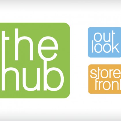
The new identity is fresh and exciting, reflecting the generation it is attracting. The typographic treatment in the logo also references the connected nature of the Hub itself, which is a space that houses a wide range of support services under one roof.
This visual identity uses one colour and one typeface, with the idea that it is very easy for a busy not-for-profit organization to apply and adhere to. The logo is simple, clean and can easily be converted to black and white applications.

