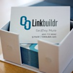
I recently designed some new business cards for Geoff over at Linkbuildr. Since the logo is quite bold and benefits from a lot of white space, I wanted to focus on the quality of the paper and the thickness of the cards to help convey the high standard of quality and service that Linkbuildr provides.
I decided to go with the new Luxe Business Cards from Moo, which are printed on beautiful 32pt stock with a seam of colour running along the sides. I kept the front very simple and used an overlapping pattern of their link logo on the back. The result is a simple card that really makes an impact with it’s tactile elements.

